

Welcome to the Innovation Workspace
Here's why you'll get from first idea to final outcome faster
The Intelligent Canvas™
Big ideas need a collaborative space to bring them to life. We designed the canvas to give teams infinite opportunities to add content, move projects forward, and work together until ideas become reality.
Where ideas turn to actions
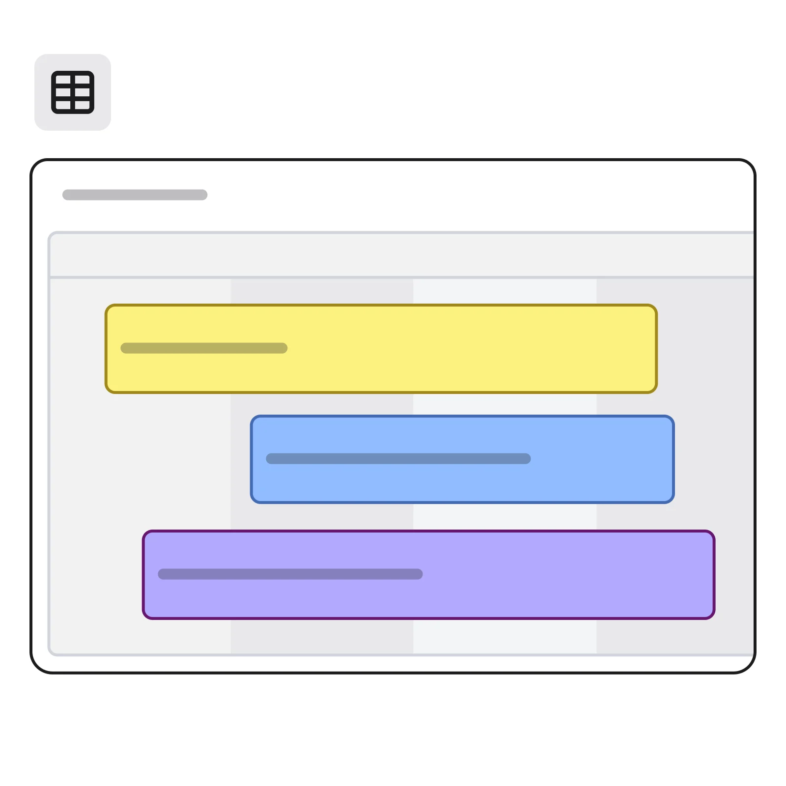
Bring ideas closer to reality and use documents, diagrams, tables, and timelines to transform creative chaos into clear plans.
With a space for every team
Organize all your project information in one place so that teams can get up to speed quickly. You can even add content and data from Google, Microsoft, Adobe, and more.
AI rapidly transforms your team's ideas into:
Accelerate work and get more done with Miro AI
The world’s most innovative companies are building their next big thing with Miro

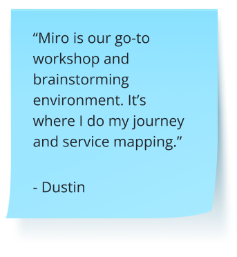
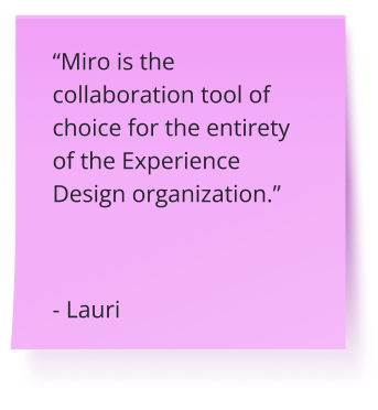
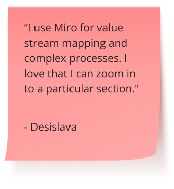
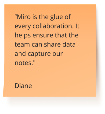
"With Miro, we went from project brief to in-market launch in 10 months. That usually takes 3 years at PepsiCo."

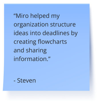
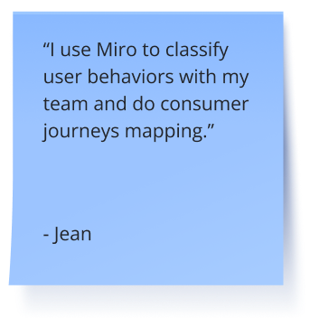
"Miro has all of those tools that help us brainstorm, vote, make decisions, and conduct user interviews all in one place. So it's really essential for effective product discovery."

"Now that we have the Miro x Jira integration, we have reduced overhead time, and we've really increased the team's happiness as employees, and driving their ability to do their planning."

"Every single engagement that we will do for a customer will have a Miro board. We'll have decks and other things that we will show, but that Miro board is really the canvas of the entire journey."

"With Miro, we went from project brief to in-market launch in 10 months. That usually takes 3 years at PepsiCo."

"Miro has all of those tools that help us brainstorm, vote, make decisions, and conduct user interviews all in one place. So it's really essential for effective product discovery."

"Now that we have the Miro x Jira integration, we have reduced overhead time, and we've really increased the team's happiness as employees, and driving their ability to do their planning."

"Every single engagement that we will do for a customer will have a Miro board. We'll have decks and other things that we will show, but that Miro board is really the canvas of the entire journey."

"With Miro, we went from project brief to in-market launch in 10 months. That usually takes 3 years at PepsiCo."

"Miro has all of those tools that help us brainstorm, vote, make decisions, and conduct user interviews all in one place. So it's really essential for effective product discovery."

"Now that we have the Miro x Jira integration, we have reduced overhead time, and we've really increased the team's happiness as employees, and driving their ability to do their planning."

"Every single engagement that we will do for a customer will have a Miro board. We'll have decks and other things that we will show, but that Miro board is really the canvas of the entire journey."
Collaborate without barriers
Communication made easy
Record a video or audio walkthrough of your content that anyone on the board can play at anytime. Or, start a live call right on the canvas where the work happens.
Smooth out processes
Try plug-and-play tools for interactive group activities, AI to automate tasks, and integrations to import and sync data.
Engage the team
Bring energy back to work and collaborate with activities like dot voting, polls, and estimation.
The one place where all teams gather to build together
The workspace where designers collaborate with cross-functional partners to create the best user-centric experiences. From design workshops to wireframes and prototypes, everything is covered.
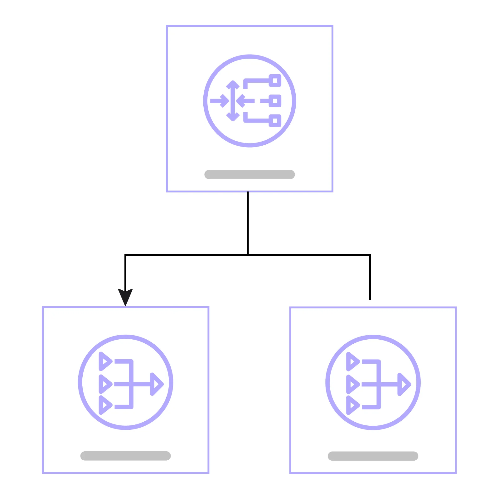
A central workspace where engineers and partners align and deliver solutions more efficiently. From technical diagrams to cloud visualization and Agile practices, everything is on one platform.
Keep programs on track with seamless collaboration through a shared workspace. Eliminate silos and ensure teams and stakeholders are aligned on goals, strategy, plans, and risks.
This is the workspace that enables marketers to streamline campaign planning, collaboration, and execution in a single platform, bringing campaigns to market faster.
Make collaborative decisions quickly, keep stakeholders in the loop, and bring clarity to the complex. This is the workspace for IT teams to visualize IT strategy, processes, and systems.

Work your way in a single, customizable platform
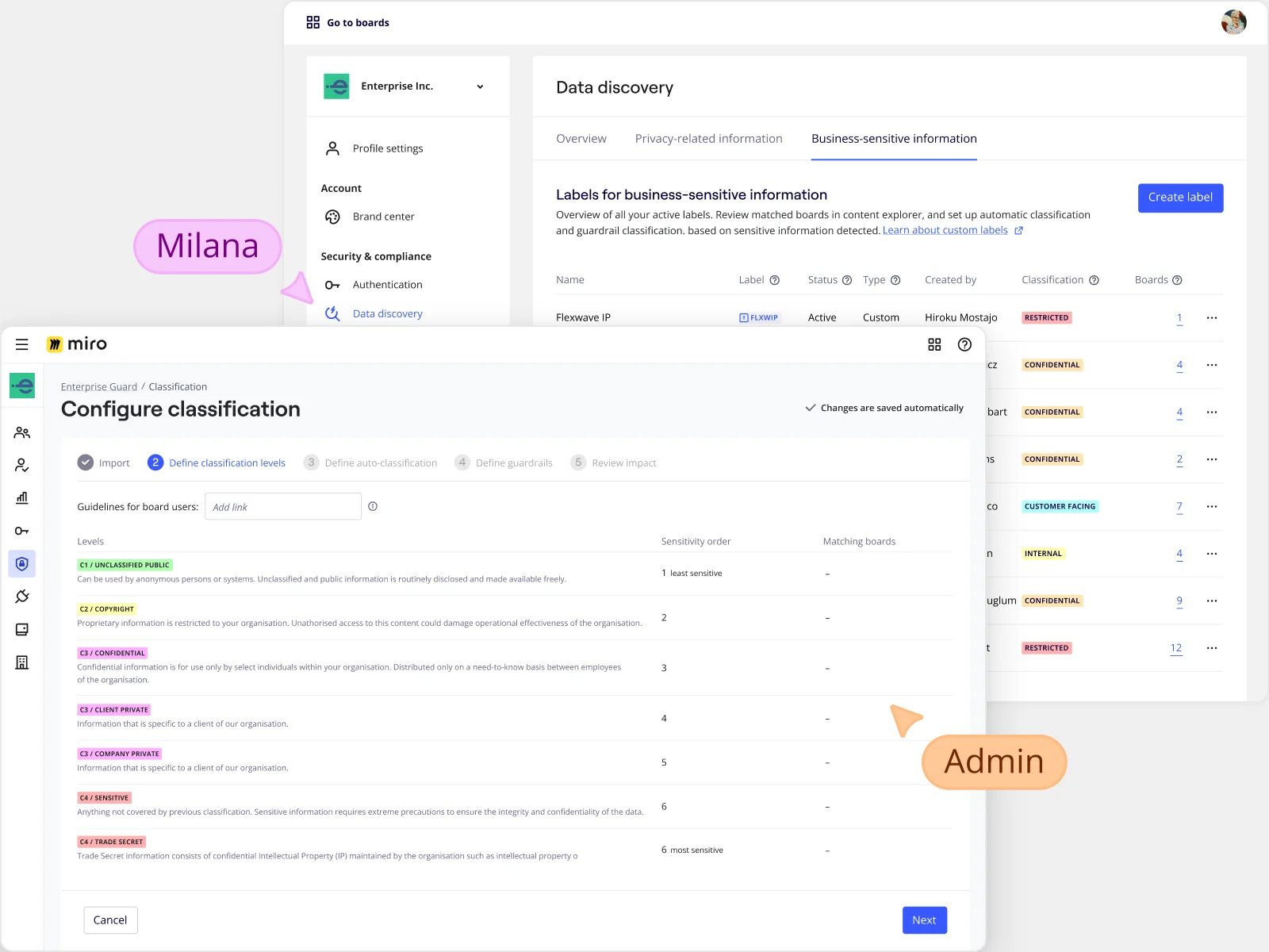
Your ideas, data, and innovation are protected. Always.
Safeguard your content
Miro offers the widest range of configurable, and native, security and governance controls. They all adapt to meet your specific requirements, no matter your organization's size or complexity.
